Rethinking Google Cloud Imagery
How can we make cloud products more relatable and aligned with brand standards?
Project type
Page strategy and redesign
Role and team
I was on the Google Store UX team, acting as the UX lead while working with 1 UX Writer, 1 Product Manager, 3 Go-to-Market Managers, 2 Creative Directors, 2 Engineering leads, and a team of 10+ design execution contractors.
Project scope
Late 2021 - Early 2022
9 weeks
Skills used
Design thinking
UX strategy
Content strategy
Vision planning
Product roadmapping
Wireframing
Prototyping
Workflow optimization
Cross functional collaboration
Introduction
While working as a contractor on the Google Cloud Platform Experience Lab Team, I had the privilege of working on a number of the platform's marketing pages used to promote and sell various GCP products and services. As one of the premiere cloud and web service providers in the cloud computing market, GCP is constantly looking to improve its site to not only effectively market their products, but align and build upon the existing Giggle brand and its properties.
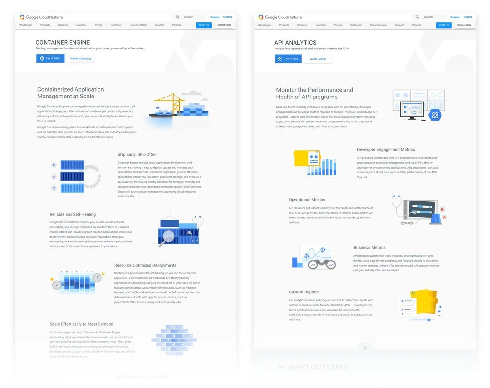
As a constantly evolving platform, GCP was looking for a way to enhance the illustration style for it's noted benefits/features within product and category pages. With over 60 products and counting, establishing this style was important to creating a language that could be replicated and repeated as older illustrations were replaced and new ones were created. I was tasked with determining the best way to approach the refresh and create a system that had the potential to scale to different parts of the GCP site.
Key context
The process of purchasing cloud computing products is not as simple as a one-click shopping experience for a smartphone or television.
Stakeholders range from executives to developers - there's an inherent challenge in marketing towards users with different levels of subject matter knowledge regarding cloud computing.
Cloud nuances can be very technical and complex - reaching these audiences at their level can be quite a challenge.
Core pain points
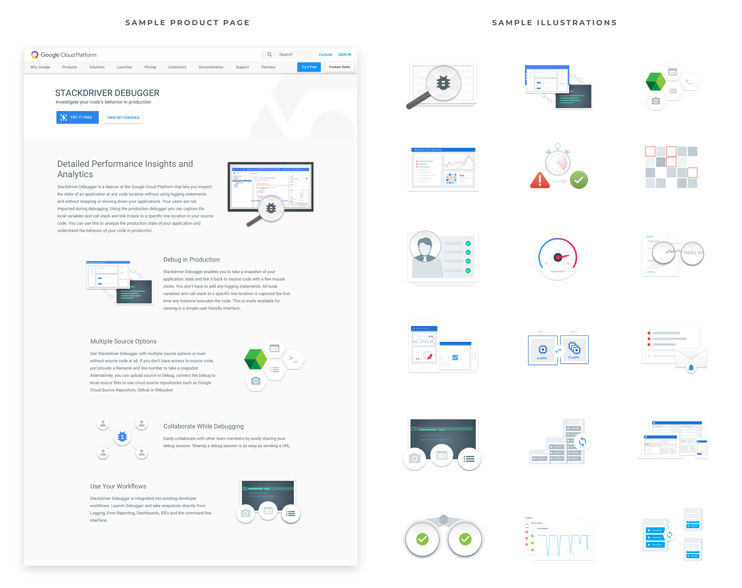
Existing style was too bespoke and custom each time imagery was created
Existing style did not feel “Google-y” and leaned too heavily toward a cold, tech world
Content, concepts, and themes are often abstract and very conceptual in nature
Core requirements
Develop a visual language that was repeatable and replicable that spoke to the Google brand and existing visual language
Create a system that could scale to other parts of the Google Cloud platform site
Discovery
Upon working on this project, I learned that many talented designers had tinkered with these illustrations at one point or another. Unfortunately, due to circumstances such as quick product launches, immediate turnarounds, or other project obligations, these designers were often unable to explore more solutions and iterate. Although they were admirable in their efforts, I sought to evolve the style a bit further.
Observations
Lacking Energy
One of the first things I noticed was a muted tone over the general set of imagery. I found it not only difficult to engage with the page content, but was not particularly interested in reading further about the product since the imagery seemed stale. I attributed this tone to perhaps a desaturated color palette and an overabundance of technical graphics, similar to diagrams.
Dated and Inconsistent
Another prevailing observation was the unoriginal nature of these graphics. This style of imagery appeared dated or "expected" and made me less interested to read the complementing text and learn more about the product. In addition, the style seemed inconsistent in both concept and execution, with color tones and values often mismatched.
Too Abstract
Many illustrations also tried to capture the entirety of a product feature with varying levels of success. Because these features contained many concepts, attempting to create an image that "said everything" seemed confusing, overly detailed, and ultimately too abstract. By trying to "say everything", I walked away feeling like the image didn't say anything.
Misaligned with Google Brand
As one of the most recognized and pioneering brands in the tech and consumer product industries, I couldn't help but feel somewhat confused about how these illustrations connected or related to the existing Google brand. They didn't seem to fit into what I imagined would be a Google-related property. They didn't feel like "Google".
Solution
Having gathered insights and deliberated with the senior designer on the GCP team, I reached a number of approaches that would address my observations while also providing a step forward towards defining a reliable and replicable illustration style for GCP products. Although there was not a formulaic approach to creating these graphics, I did follow some general guidelines to help me systematically create viable illustrations for any given product.
A consistent, simplified palette
By adopting a shared color palette, illustrations would have a foundational thread in common to be related or viewed as a family. Creating a simplified, Google-approved palette was an easy way to cue visual connections between images to show they belong together. To me, this was critical to setting a tone and a base in which to build upon.
Adopt a Google Illustration style
Although it was important for these illustrations to look like a family, it was even more important for them to be a part of the Google family. To do this, I studied existing illustration styles used by the Web Marketing teams and chose to use existing components and build custom elements when necessary. Taking into account attributes like perspective, shading, amount of detail, and color usage- I was able to expand the family.
Blue as a distinguishing color
Being merely connected to Google is not enough. Understanding what product or entity these illustrations belonged to was paramount as well. Establishing a way to distinguish the images from other Google products was important to taking an additional step to creating a unique solution. We decided that using a predominantly blue color palette could achieve this goal while not departing too far from the existing execution style.
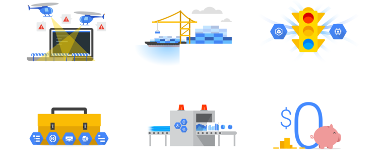
More literal, tangible concepts
To this point, I had focused on establishing visual consistency. Shifting my attention to conceptual direction, I wanted to address the need to appeal to a wider audience and for these images to be more easily understood. To do this, I chose to veer away from abstract concepts and focus on more literal and tangible themes that could hopefully simplify and defuse the complexity behind these features. Using objects that were recognizable and lightweight was of key.
Compose in collage, not abstract
After making a number of illustrations, I realized that developing tangible concepts was not always a viable solution. Sometimes the source concept was so abstract, only pieces of the feature could realistically be portrayed. As a result, I would focus on the key takeaways, choose a tangible representation for them, and merge them together in a collage composition. Doing this allowed the illustration to relate to the feature, without having the burden of summarizing every point...
Concept as a sidekick, not the hero
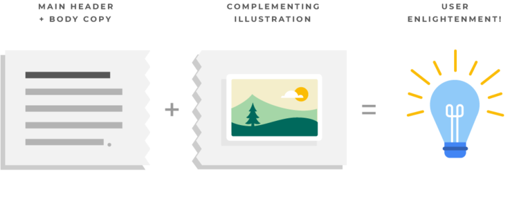
... which led to an important overall approach to these illustrations. It became clear the role of these illustrations was to act as a sidekick or complement to the main header and body copy, and not as the hero or main feature. To expect these images to have an equal impact or proportionate understanding as the text was unreasonable. It just wasn't likely or realistic.


