Veggie Grill App
Personal Project
Project type
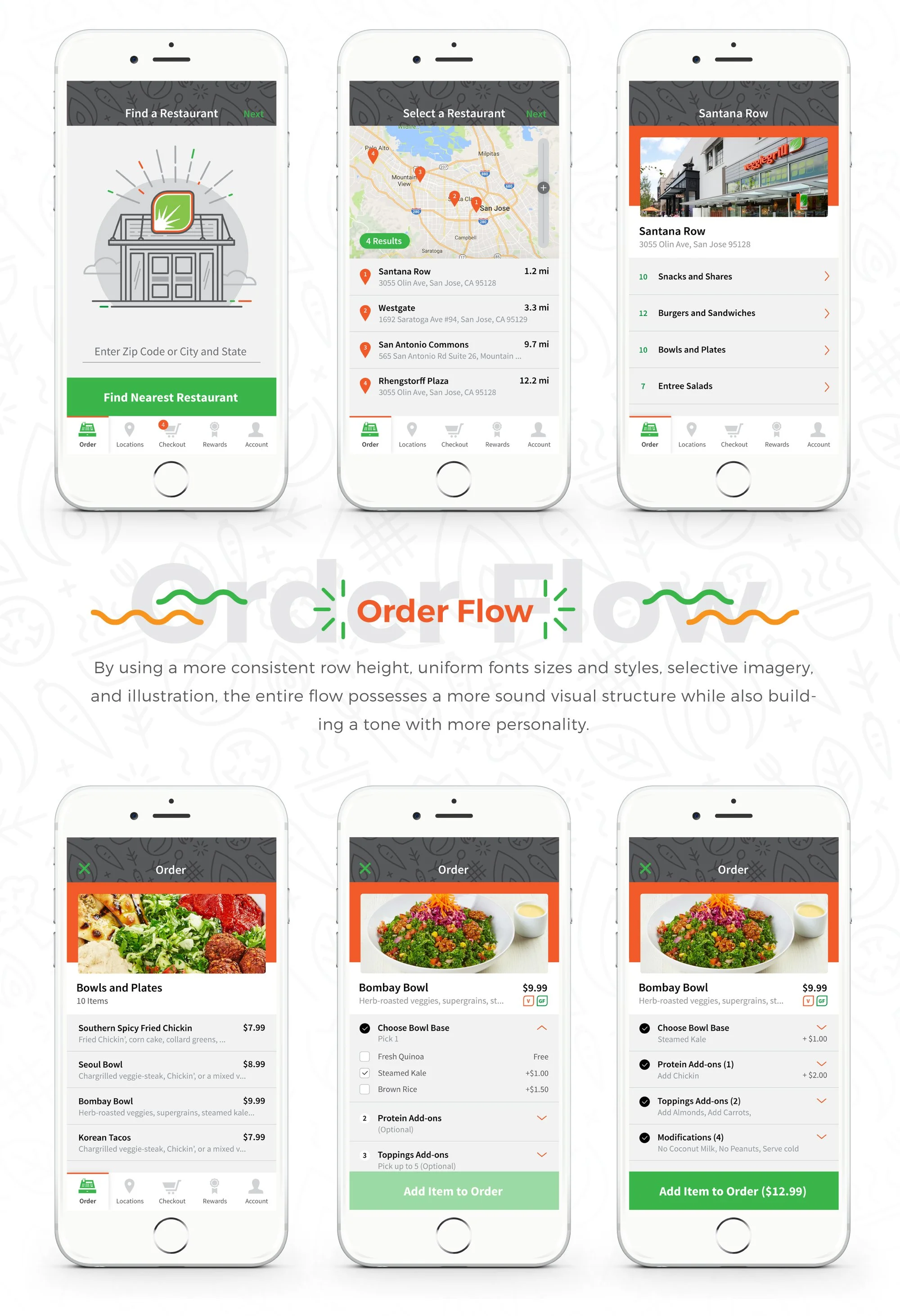
Visual Design refresh and minor UX core flow updates
Role and team
UI / UX Designer
Project scope
7 days
January 2017
Skills used
Design thinking
Content strategy
Wireframing
Prototyping
Visual design
Introduction
As a resident of the Bay Area for almost 6 years, I've realized there is no shortage of delicious food options that ultimately take their toll on the waistline. Fortunately, there are plenty of healthy options in which to indulge as well. One of my favorite options is Veggie Grill, a purely vegetarian franchise founded in 2007 around the Santa Monica area. With so many choices across a variety of cuisines, Veggie Grill's popularity has been on the rise in recent years. Although their food options feature range and versatility, the same can't be said about their mobile app.
Key context
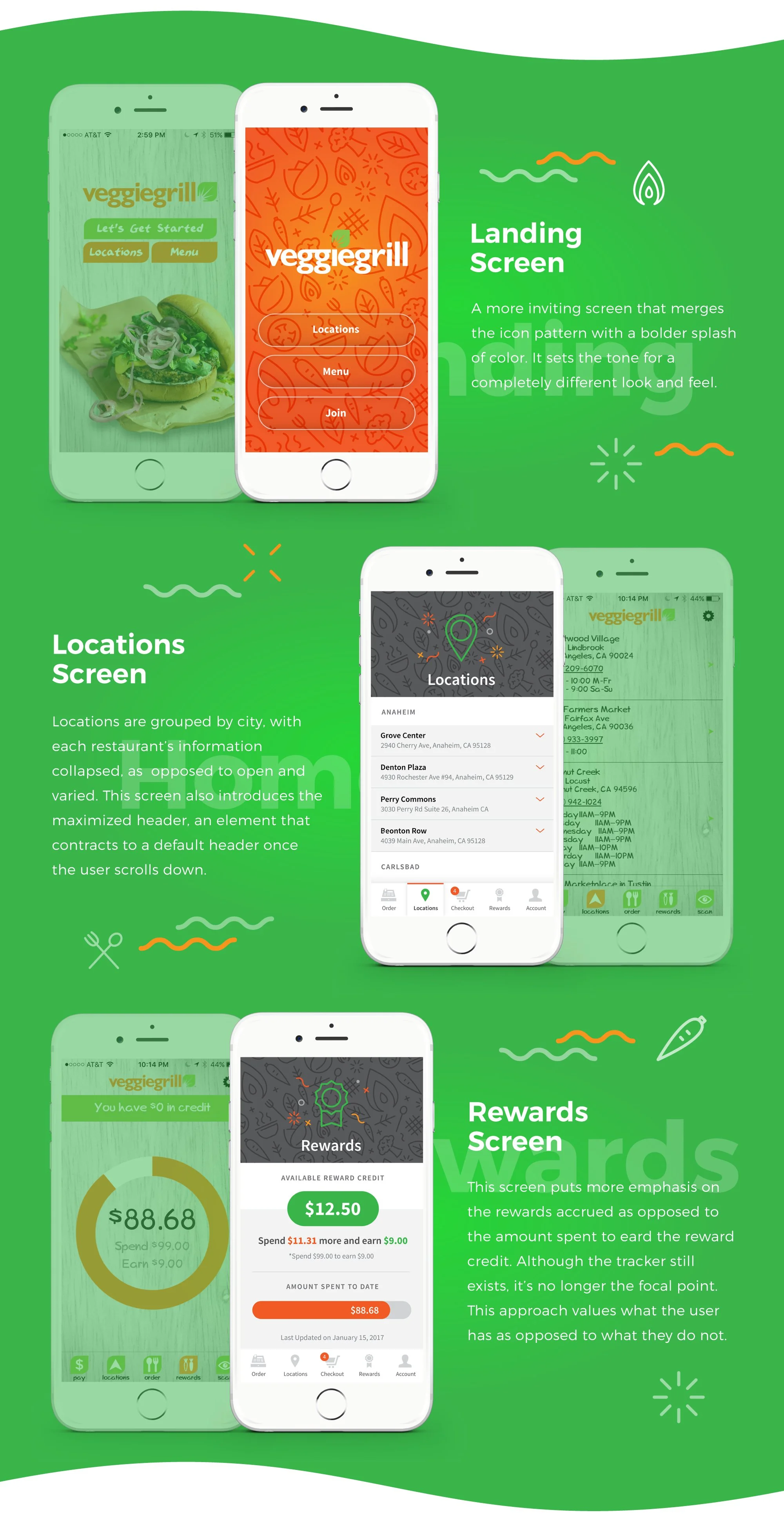
Unfortunately, the current design's features, task flows, and lack of visual style leave much to be desired. It appears as if the overall structure of the app is just housed within some kind of template, with the opportunity to style certain elements such as the header, some fonts, and minor iconography.
Problems, opportunities
In short, the app is outdated and is difficult to use, let alone look at. The vibrant nature and progressive style of food don't seem to align and resonate with the app experience. The problem seems to be three-fold, needing heavy care towards the UX, UI, and Visual Design. Within this project, I chose to focus on brief UX issues and focused mainly on the latter two disciplines.
Core requirements
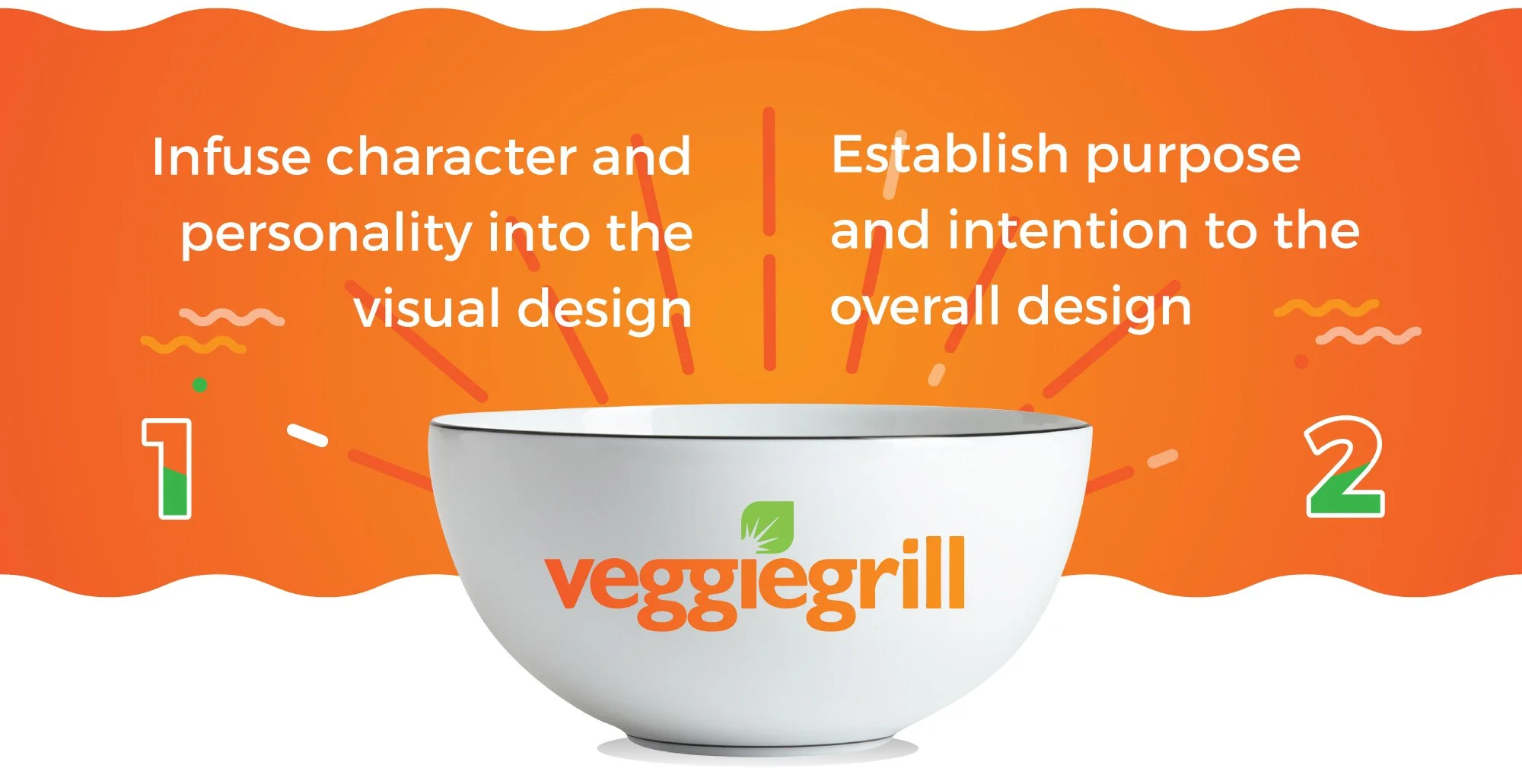
Infuse character and personality into the visual design
Establish purpose and intention to the overall design
So, what’s the plan?
Because there were a number of issues to potentially tackle, I wanted to focus my intentions and establish some overarching mentalities in which to approach the problems. In short, I wanted to find a way to infuse character and personality into the visual design, while establishing a more deliberate purpose and intentionality. Much of the current app seems to lack any kind of structure, rule, or cohesiveness.
Approach
Defining a style
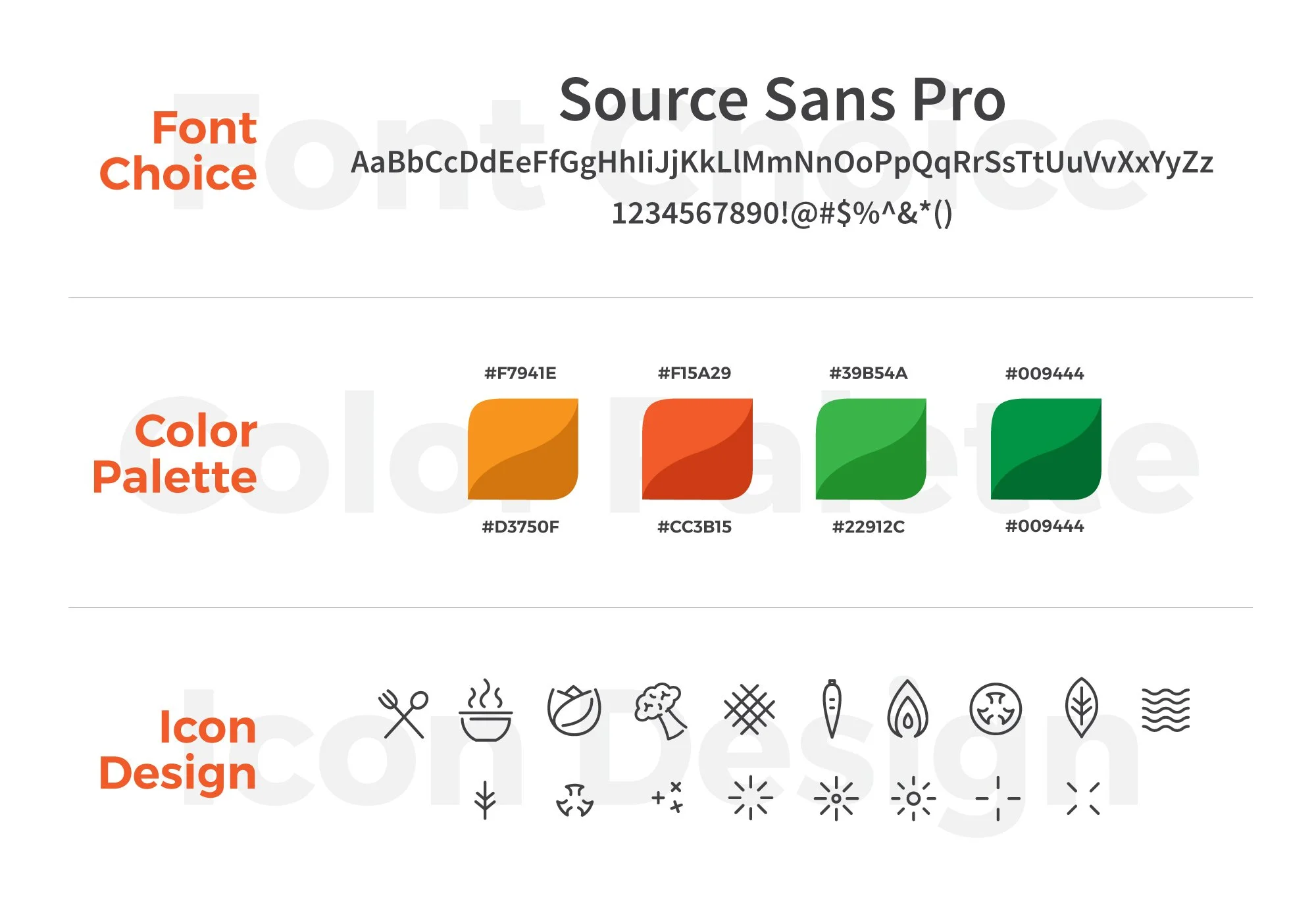
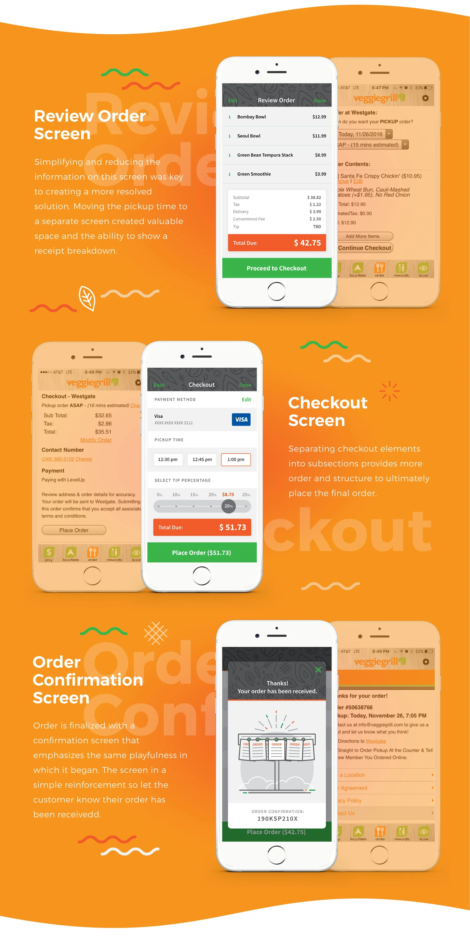
Although the current design makes moderate efforts to mildly stylize the interface, it's a far cry from what is possible. Removing their rustic, themed font and replacing it with Source Sans Pro, a much more legible and functional option was a necessity. Then, adding a more diverse color palette that relates to their brand colors created more options in which to accent and accentuate graphic details. Finally, inserting iconography and illustrations really ads a splash of fun and personality into the entire tone and aura of the app.
Solution
Solution


